Do you need you class to make a poster in Photoshop? Here's a step-by-step guide.
From the excellent blog Spoon Graphics, by Chris Spooner - visit it here.
I’ve been wanting to have some fun with the low-fi poster style that’s usually associated with punk rock gigs and revolution propaganda, but I couldn’t decide what to base my fictional design on. Then I saw the trailer for the new Rogue One movie and I knew I had to produce a Star Wars themed design for this tutorial! Follow along to see how to create a grungy propaganda poster for the Rebel Alliance in Adobe Photoshop with dirty textures, spray paint effects and a low-cost, hand made feel.
The design we’ll be creating in this tutorial is the ultimate anti-establishment message from the Rebel Alliance. It’s made in the style of the cheap flyers and posters made by underground movements, that rely on low-cost production methods like cutting and pasting photographs, hand-painted typography and low-quality photocopy prints. We’ll be creating this artwork 100% digitally, but with the assistance of handmade resources that will help to achieve the collage aesthetic.
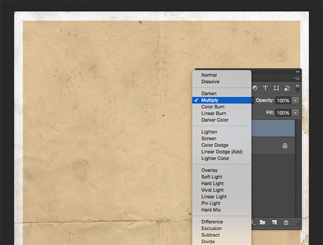
Begin by downloading a paper texture and opening it up in Adobe Photoshop. Press CMD+A to Select All, followed by a right mouse click and choose Transform Selection. Hold the ALT key and scale the selection down to leave a border. Fill this selection with #dcbd88 and change the blending mode to Multiply.
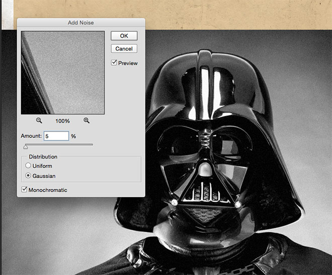
Steal an image of Darth Vader from Google Images and paste it into the working document. We’ll have to rebel against copyright in this tutorial and hope the Disney empire doesn’t strike back! Desaturate the image, then go to Filter > Noise > Add Noise. Enter 5% with the Gaussian and Monochromatic options checked.
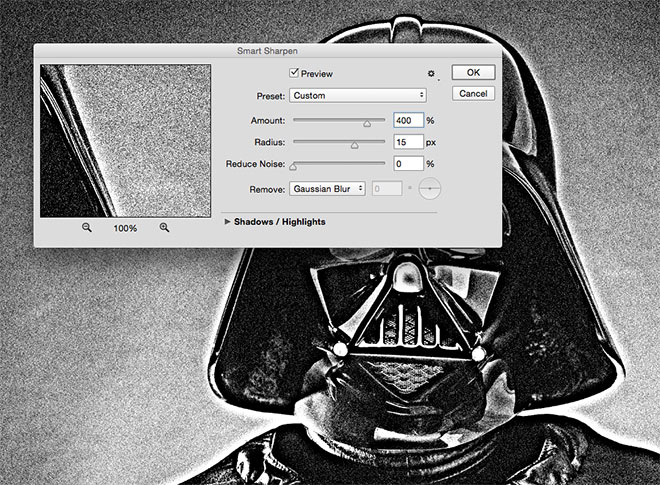
To give the image a photocopied appearance, go to Filter > Sharpen > Smart Sharpen. Adjust the settings to 400%, 15px radius and 0% noise reduction.
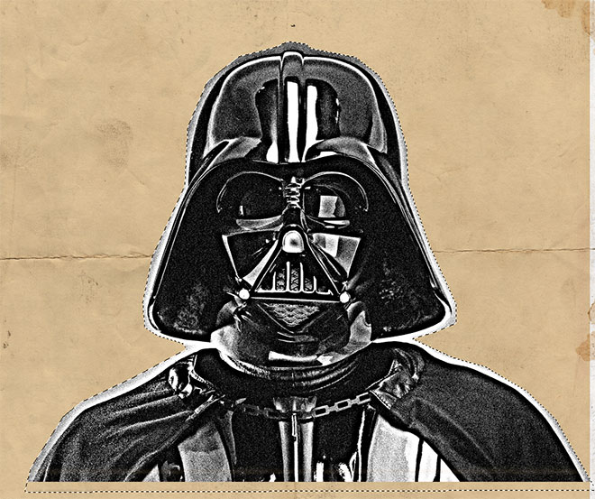 Use the Polygonal Lasso tool to roughly trace around the outline of Darth Vader, then go to Select > Inverse and hit the Backspace key to remove the background.
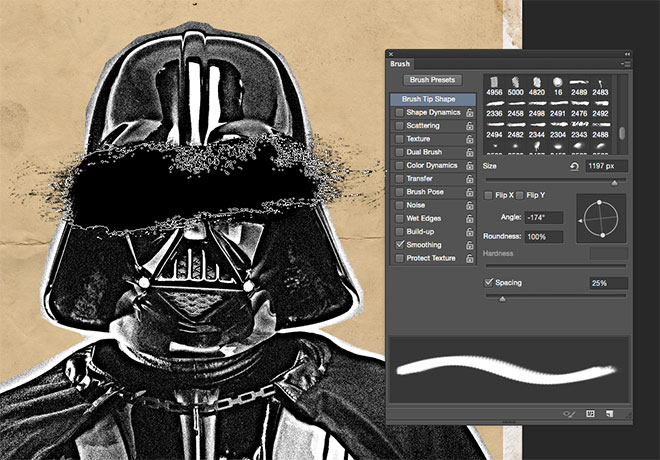
Download my old Rough and Grungy Photoshop Brushes (or my more recent Dry Brush Strokes) and adjust the size and angle from within the Brushes panel to deface the image of Darth Vader.
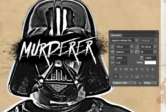 Use a display font to add some hand-drawn typography to the artwork. I’m using the lovely font Againts, which has a messy hand painted brush style.
To produce realistic hand-drawn typography, it used to be necessary to physical draw and scan the text yourself, but many premium display fonts now have alternate characters so any duplicate letters can be given a different appearance.
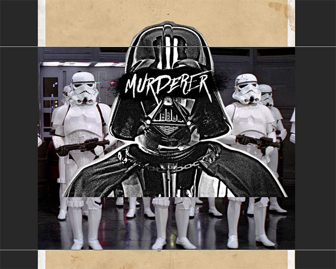 Paste in an image of some Stormtroopers underneath the Darth Vader layer and scale them to size so they’re visible at either side of Darth Vader’s head Since we’re going for the low-quality look, it doesn’t really matter if the image has a low resolution. Desaturate the picture and add 5% of grain, just like the previous steps.
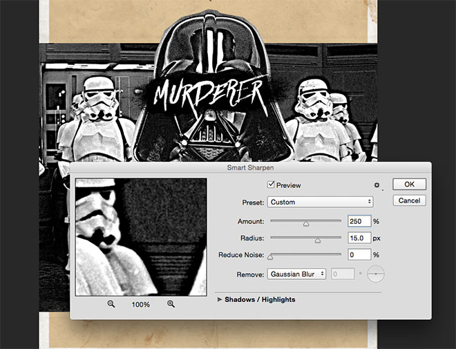 Continue to add a Smart Sharpen filter to produce the photocopied look, but adjust the Amount value to 250% to avoid blowing out the whites too much.
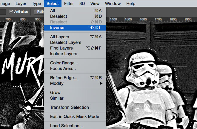
Use the Polygonal Lasso tool to trace around the outline of the Stormtroopers to represent a rough cut out done with scissors, then Inverse the selection and delete the background.
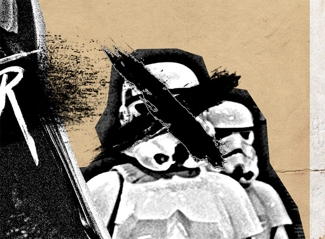
Select one of my Photoshop Brushes and reduce the size to fit over the Stormtrooper’s head. Change the angle so the brush flows diagonally, then place two separate brush impressions to form a cross. Mix up the brush selection each time to avoid repetition.
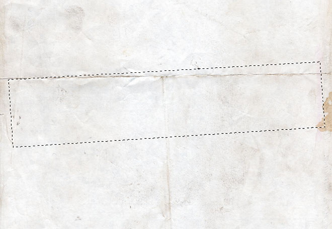
Open up the original paper texture in a new Photoshop document and draw a rough rectangular selection using the Polygonal Lasso tool. Copy and paste this clipping into the working document.
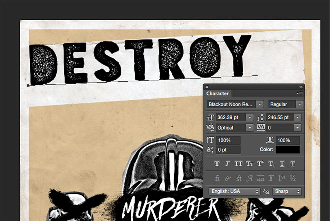 Use the Type tool to add some more text to the artwork. Posters of this style would often use ransom style letter cuttings from a newspaper, but the Blackout Noon font used here provides a distressed low-quality print effect.
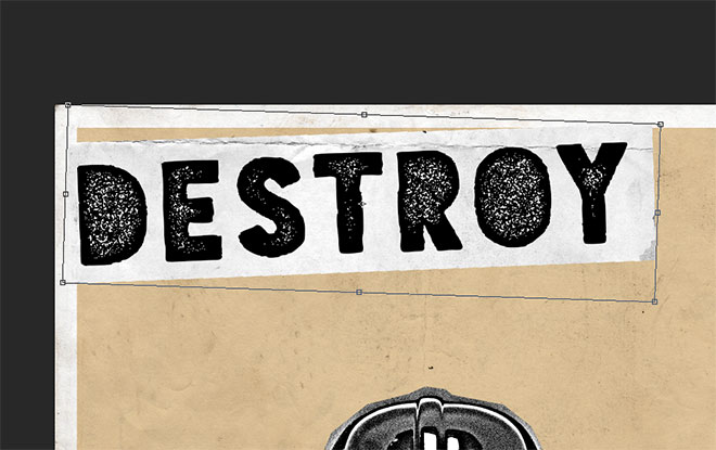 Press CMT+T and scale the background strip to roughly fit around the text. Angle both the text and the paper strip slightly to enhance the unrefined look.
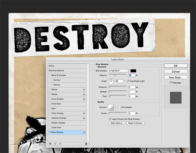
Double click the paper strip layer and set up a Drop Shadow using the settings black, Linear Burn, 35% opacity, 2px Distance, 1px Spread and 3px Size to give the impression that the text has been cut and pasted onto the page like a collage.
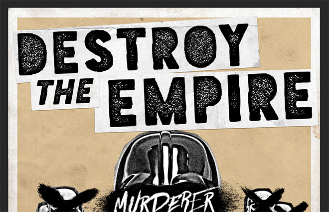
Continue typing out the wording ‘Destroy the Empire’, using separate text elements for each word so they can be individually angled and offset. Add a paper strip background for each one and copy the layer style between them.
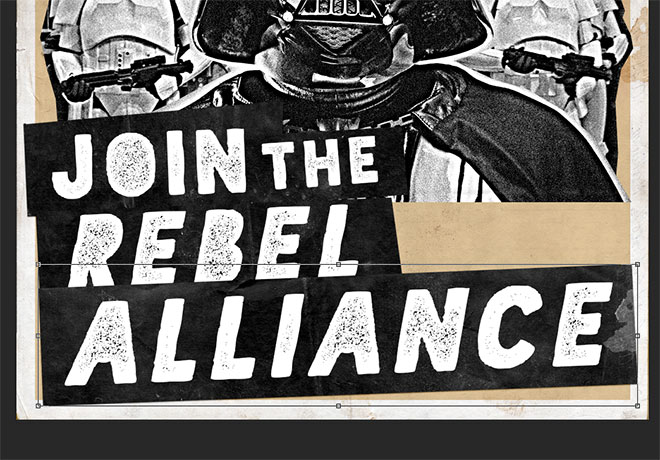
The same text effect can be applied elsewhere on the poster design, but with the background strips inverted (CMD+I) and the text set in white.
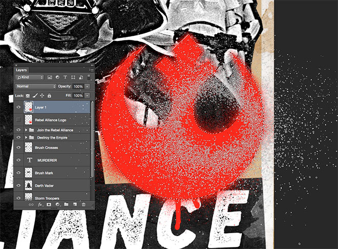
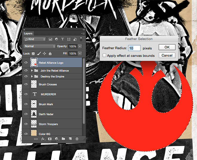 Download a copy of the Rebel Alliance logo and position it on the poster design. CMD+Click the layer thumbnail to load its selection, then go to Select > Modify > Feather. Add a 10px radius, then turn off the visibility of this layer.
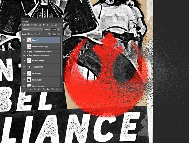
Create a new layer, then use my free Spray Paint Photoshop Brushes to fill the selection with red (#cc0705). Use the fine edge of the spray brush so the selection isn’t filled with a solid colour.
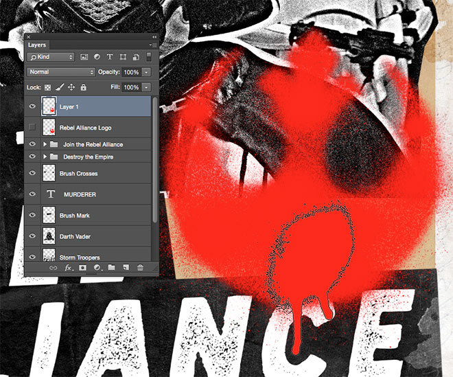
Change the brush to a different spray paint splatter and reduce the size to fit within the logo, then add some oversprays around the edges.
Load the selection of the original logo layer, then use a spray paint brush to softly fill in portions of the selection with a crisper edge.
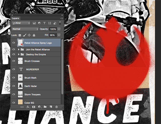 Reduce the fill amount of the layer to 96% to allow the underlying elements to show through slightly, which finishes off a realistic spray painted stencil effect.

Paste in a copy of the Imperial logo, then draw a circle with the Ellipse tool. Set up a large red stroke to form the foundation of a ‘No’ symbol.
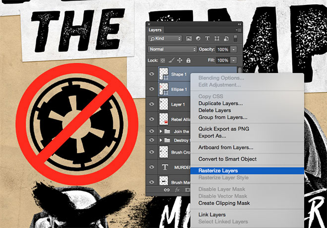
Draw a diagonal line to finish the symbol by matching the size to the weight of the circle’s stroke, then select both shape layers and Rasterize them, followed by the shortcut CMD+E to merge them into one layer.
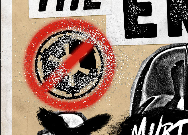
Load the selection of the symbol layer, feather the selection and follow the previous steps to create a spray-painted stencil effect for this element.
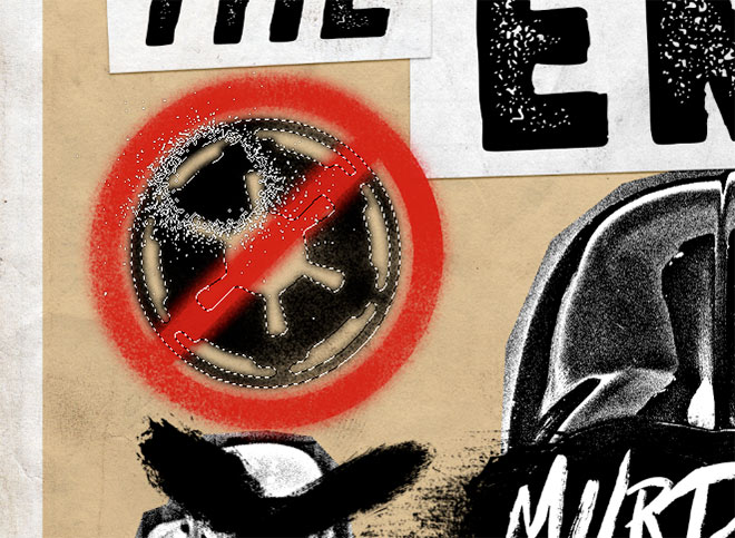
Repeat the process with the Imperial logo, except this time use black to contrast against the red symbol. Due to the smaller scale and higher detail of this logo, only feather this selection by 5px.
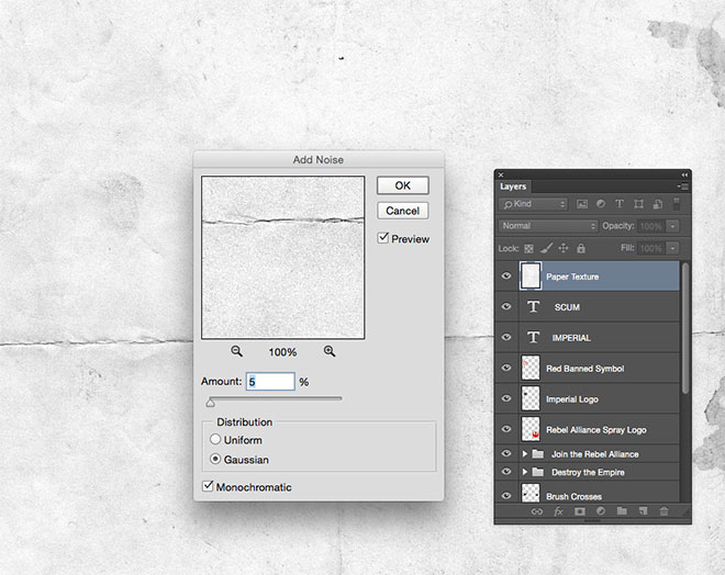
To finish off the artwork with more grungy textures, make a duplicate of the paper background and drag it to the top of the layer stack. Add 5% of Noise from the filter menu.
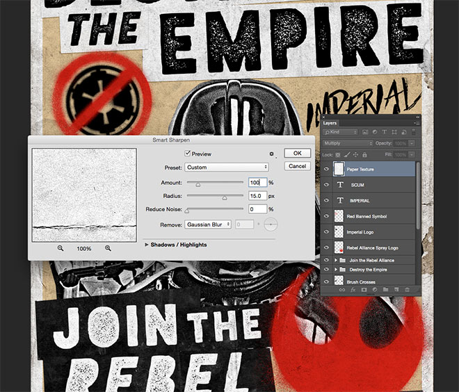 Change the blending mode to Multiply, then add a Smart Sharpen filter to bring out the details and boost the contrast. Keep an eye on the preview and balance the Amount to provide the desired result. 100% gave a nice mix of grainy tones while not being too overpowering.
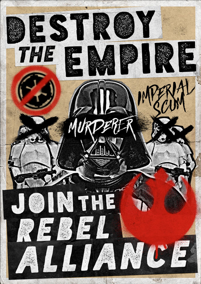
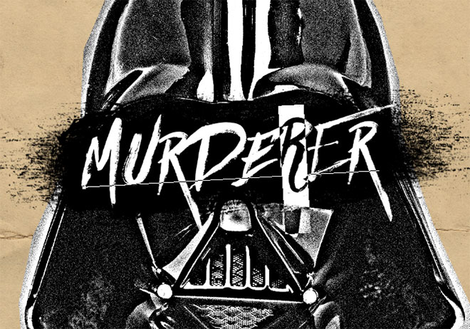
The final design captures the style of those grungy gig flyers and revolution posters by mimicking the low-cost production methods in digital format with a variety of resources and filters. The limited colour palette, photocopy print effects and collage style all enhance this visual aesthetic, which makes the Rebel Alliance seem like the anarchists of the galaxy!